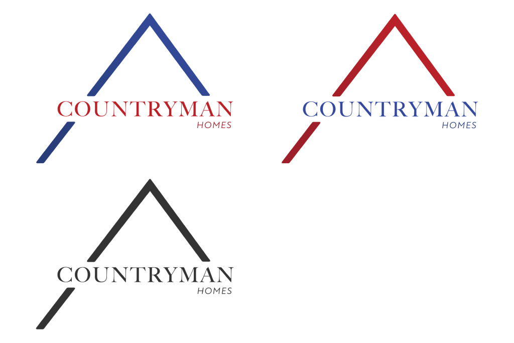
Logo Design
The client is a new real estate agent who needed a logo design for their beginning business. They wanted a logo that incorporated an upside down check mark to resemble a roof top, but not in an obnoxious manner. The tone and feel the client desired in this design was protection, safety, strength, comfort, and modern.
